If your photos are boring, get closer. This was sage advice from photographer from long ago. What he was saying is that the most common mistake when composing a photograph is including too much. Landscape photographers are particularly culpable in this respect, because it’s often the vastness of the landscape that has us reaching for our cameras. But everything cannot be your subject. Including too much often results in a photograph with a small and insignificant subject and nothing to focus our attention. In this respect, landscape photography is somewhat counter intuitive. While it is often the vastness of a landscape that is inspiring, including too much of it can diminish the impact of a photograph by shrinking the important elements to insignificance. This is one reason that shooting landscapes with ultra-wide (12mm-24mm equivalent) lenses can be so challenging. Not only do ultra-wide compositions require good light across a wide swath of the landscape, but they also require distant compositional elements that remain strong even when rendered small. You’re much more likely to find a compelling slice of a landscape, with good light and a strong subject, than a wide vista that shows up well in a photograph. If it’s boring, get closer and crop out anything that doesn’t strengthen the composition.
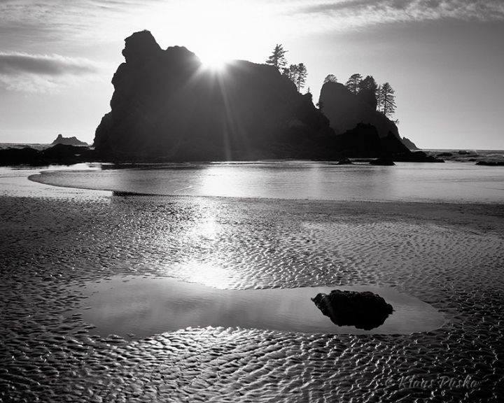
This leads us to a first principle of composition, which is to make the subject dominant in the frame. Of course, this assumes you’ve decided on a subject. Since everything cannot be the subject, you must choose which part of a vast landscape is most compelling and focus on that. Dominant shapes, light, or color can all draw a viewers attention into a photograph. In the image “Point of Arches Tide Pool”, the silhouetted sea stacks are a dominant shape and the sun is a dominant light. This medium format image was taken with a slightly wide (40mm equivalent) lens. If I had chosen a wider lens, the diminished sea stacks would have had less presence. Getting closer made this composition stronger. There are two ways to get closer, zoom with your lens or zoom with your feet. Either way, making the subject dominant in the frame will likely strengthen the composition.
A second principle of landscape composition is to include a strong foreground. Your subject needs a supporting cast, compositional elements that provide perspective and lead the eye to into the photograph. Pointing the camera down slightly to include a strong and recognizable foreground gives the viewer a place to stand, adding perspective and depth to the composition. Just like the subject, the foreground is most effective if it’s a substantial element of the composition. Foregrounds that depend on fine detail, such as leaves, grass, or pebbles, tend to not provide as much depth to an image. Look for larger foreground elements, such as reflection pools and large stones, to provide a good anchor for the viewer and lead the eye into the photograph. By pointing the camera down slightly and including a strong foreground, you also emphasize the scale of the distant subject as it pushes against the top of the frame.
This leads to a third principle of landscape composition, the rule of thirds. Dividing the landscape into thirds, or even fourths, helps create a sense of depth and scale, as well as a feeling of balance. The transition from foreground, through middle ground, to background adds depth by drawing the viewers attention into the image. Depth is also created from our innate sense of distance based on the relative sizes of near and far objects. And as mentioned, the closer your subject is to the top of the frame, the taller it appears, adding to the sense of scale. Finding balance in a composition is a bit more mysterious. You would think, dividing your composition into equal parts, by putting the horizon in the middle of the frame, would be perfect balance. Yet this is one of the most common mistakes made by novices. The only time it works to put the horizon smack in the middle of the frame is when you have absolute symmetry, such as a perfect reflection of the sky in the water. Otherwise, you’re almost always better off placing the horizon a third, or even a fourth from the top of the frame. If the sky is particularly interesting and there is no compelling foreground, then the horizon can be a third or fourth from the bottom of the frame, making the sky your subject. Either way, don’t put the horizon in the middle unless you’re seeing symmetry.
These three rules of composition will help cure some of the most common problems in landscape photography. While they are by no means exhaustive, they are a good starting point. Once you have a strong and dominant subject, a strong foreground, and good balance to your composition, there is one more thing to do. Look around at the edges of your screen or view finder to see if there are any distractions, like an intruding branch at the frame’s edge. If so, change your position slightly to exclude anything distracting. All of this is, of course, easier to do when composing on a tripod. While the tripod is employed most often for image sharpness, it is an equally powerful tool for composition. It allows the time to really look at your composition and often make very minor adjustments that make the difference between a keeper and the recycle bin.
Landscape photography is a contemplative art that benefits from slowing down. It requires seeing what is present through the limited canvas of the camera, rather than seeing through the lens of our expectations. As landscape photographers, we are inspired by the grandeur of nature. And so our impulse is to capture as much as possible. But like poetry, a photograph can often express more by showing less. A strong foreground adds depth to a two dimensional canvas and placing the subject off center adds scale and balance. Finally, eliminating distractions will ensure your subject shines. Of course, there are always exceptions to the rule. But as great painters and poets know, you must first learn the rules before you can bend them in creative and startling ways.


Leave A Comment